This article has been written to explain the importance of having a brochure for your business and how to create a good brochure that gives the best ROI in marketing. It will come in handy for small and medium-sized businesses, brochure designers, and people in business development.
Table of Contents
Introduction
I remember the day when I first tried explaining all my products and services to people who walked inside my store. For those who don’t know, I run a small bakery and we are experts in custom cakes, pastries, and desserts for every occasion.
I ended up giving a 10-minute-long rant about all the flavors, designs, and customization options we have. By the end of the rant, the customer forgot half of what I said and got confused in the other half of it.
Eventually, he left and decided to buy from another bakery which was our direct competitor and god knows how they were doing 10X our revenue even though we had better products.
This was a problem I faced almost every day in the starting phase of my business, and it was making me lose a lot of customers.
I always used to wonder at night while being sleepless, “How can I explain everything I have, along with all the flavors, designs, and options, without confusing or wasting 10 minutes of neither me nor my customer?”
During this problem that I was facing, I noticed my competitor bakeries were thriving. They had less staff than me but their customers didn’t complain about getting confused.
That was the day when I investigated them a little and came to know that they are giving brochures to the customers instead of giving a 10-minute rant like me.
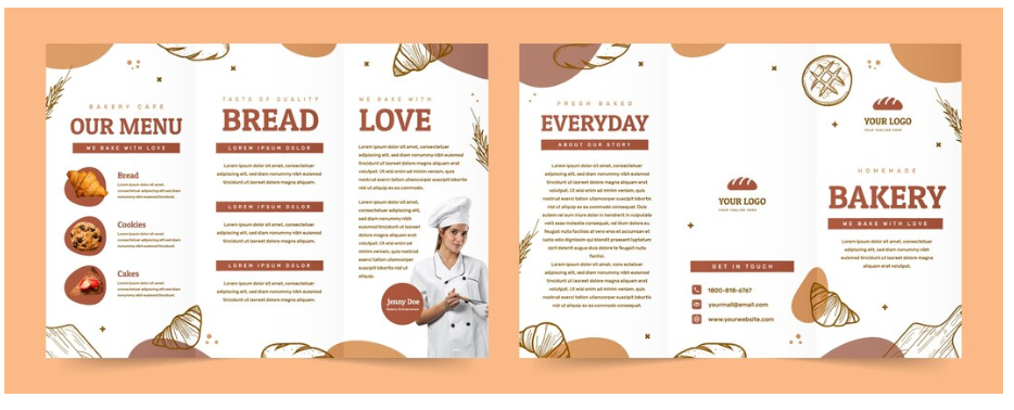
For those of you who don’t know – A brochure is a printed or digital document that explains your products/services in an organized and interesting way. It highlights features, benefits, etc making it easy for customers to understand what you provide and how it can help them. It helps the customer understand everything at a glance and make decisions quickly.
Here is a sample image of how it looks:
So now that I had figured out the secret, I knew how to solve this problem. That day, I created a brochure for my bakery, and trust me when I say this, I was better off without one.
Why? I made a dustbin–quality brochure and realized that having a bad brochure is worse than having no brochure. Now those small numbers of customers who I sold with my 10-minute rant? Even they left me.
That is when I realized that I don’t just need a brochure but I need the RIGHT brochure. So I started researching and learning about how to create the perfect brochure.
I spent more than 200 hours learning and more than 6 months trying out several different kinds. I made changes and split-tested them all to find out what worked the best.
Now I am going to share everything I learned in those 6 months (for free) so that you don’t have to face the same problem that I did but first, you need to understand why having a brochure is so important for a business.
Why having a brochure is important for every business
If you’re wondering whether your business needs a brochure, let me make it simple for you – It can make a big difference in attracting and keeping your beloved customers.
Here are 6 reasons why having a brochure is so important:
- A brochure may help people remember your business because it’s something they can see and hold. They are good for events and help you leave a more memorable and trustworthy impression.
- One marketing tool that doesn’t require the internet, is a brochure. A brochure never lets you down when you meet someone at an event, and have a bad network but still need to share some details quickly.
- Not only do good designs and layouts grab people’s attention but also let people know more about your business. A visually appealing brochure engages readers and lets them understand your products or services easily.
- You can’t reply to every new customer to explain your products and services, hence brochures save a lot of time for you as they combine all the important details in one place. This makes sharing information easier and faster.
- Brochures can be so easily shared by customers among their knowns which will spread word about your business and help you reach more people without additional efforts.
- Not only does a brochure make your business look professional but it also helps in building trust with potential customers.
These are just a few of the reasons why having a brochure is so important for your business. A study from Bentley University found that 85% of people learn about a new business by engaging with a brochure.
A step-by-step method to create your own brochure
85% of people learning about a business from their brochure is a huge number, but as I explained my experience to you earlier, it also comes with a risk. If it’s not done well, it will not reach the mark.
However, if you do it right, it could multiply your revenue. The first step to doing it right is to understand which kind of brochure you even want in the first place.
Step 1: Choose the type of brochure you want to have
A brochure can come in multiple types, like Bi-fold, Tri-fold, Z-fold, Gate fold, or even custom shapes. Not only that but we can also have web brochures in the form of PDFs.
Confused about what they mean?
These simply refer to how many pages your brochure is going to have. Here are the different types of Brochures:
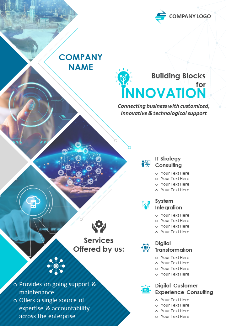
- Single-page brochure
It has a single sheet with details printed on both sides which is perfect for flyers, event announcements, or quick promotions. If you want to get your message across quickly without overwhelming your customers, this is perfect for you.
Most of the web brochures out there are single-page brochures. Single-page brochures work best when you want to promote a single product or event.
Here’s what it might look like:
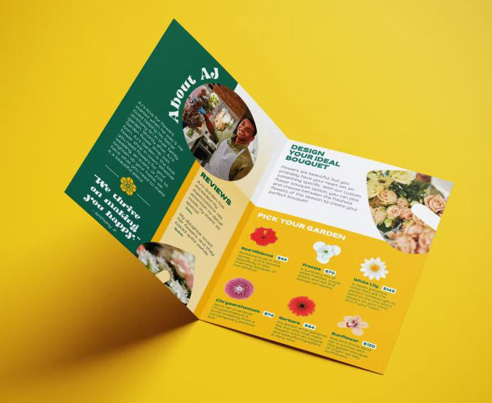
- Bi-fold brochure
It is a single sheet folded once to create four panels (front cover, back cover, and two inside panels) making it ideal for simple, professional presentations of information with multiple images.
These brochures work best for highlighting more than one product/service. If you decide to make it digital, remember to place the pages vertically as more often than not people will be glancing at it on a mobile screen.
Here’s what a Bi-Fold Brochure can look like:
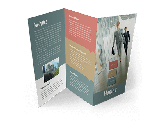
- Z-fold brochure
It is folded in a zig-zag shape, creating six panels that are great for storytelling, step-by-step processes, or event itineraries.
It works best when you want to guide your audience through a process or tell a story. In web format, the pages will simply appear one after the other. I recommend this mostly for prints.
Here’s what a Z Fold Brochure looks like:
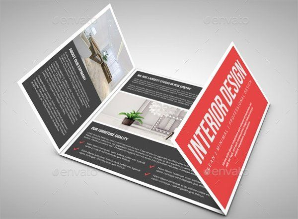
- Gate fold brochure
It has two smaller panels that fold inward like gates to reveal a larger inner panel, which works best for showcasing high-end products or eye-catching visuals.
Gate-Fold Brochures work best for luxury products or exclusive events as they add a touch of elegance and surprise to the presentation. Again mainly for print unless you add a little animation to it like people clicking on the gate and it’s opening to show you what’s inside.
Here’s what a Gate Fold Brochure looks like:
- Roll fold brochure
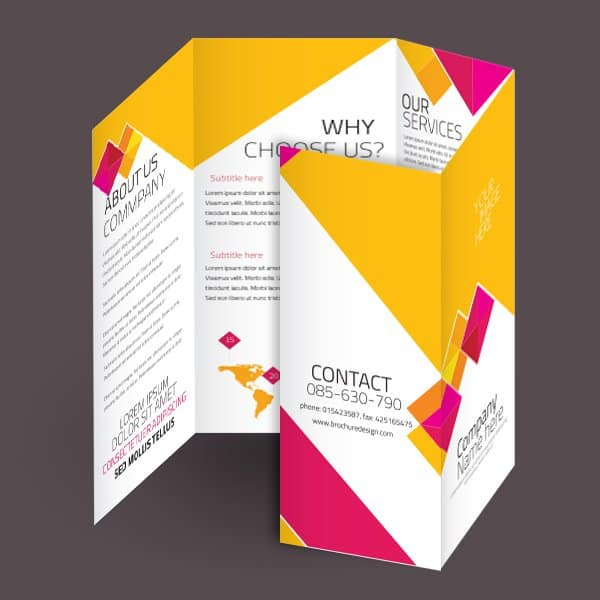
It has panels that fold inward on top of each other in a rolling manner, making it ideal for progressive information like product catalogs or guides.
Only choose Roll Fold Brochures if you want to show detailed steps for something to do. I won’t suggest this for the web at all as simple bullets work best there.
Here’s what a Roll Fold Brochure looks like:
- Multi-page brochure
It is a stapled or bound booklet with multiple pages, making it best for detailed product catalogs, annual reports, or company profiles.
This is where you build prestige and authority. It works almost as well as a detailed website. Use this when you want to make a physical impression. Something your customer will take a very close look at, and maybe repeatedly.
This will be your best bet If you want to include a lot of information in an organized manner.
Here is an example of a Multi Page Brochure:

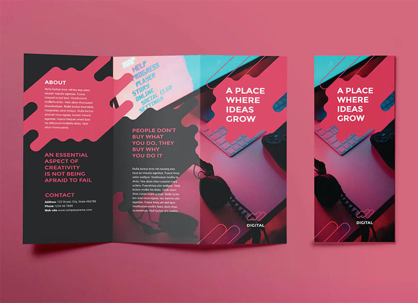
- Web brochures
It is a page-wise brochure that is not printed, but instead saved digitally in the form of PDFs and shared online through emails or other mediums.
It is best if you want to have animations and other interactive elements in your brochures and want to look modern without spending a ton on printing.
Here is an example of a Web brochure:
By now you might have decided, according to the purpose, which brochure are you going to choose. However, just the formats, designs, or types of brochures will not do the desired work for your business.
The secret ingredient lies in the stuff that’s present inside it. I mean the texts, headlines, or the images. They have to be written in a manner that resonates best with the audience.
Step 2: Writing the perfect content inside a brochure
In my early days of almost ending my business with the bad brochure, I had done 500+ split tests with all different kinds of content inside the brochure.
I watched my competitors’ brochures, researched what worked with top companies in the world, and came to the conclusion of what works best. Here is everything that you need to know:
- Headline
The game starts with a headline as it is the first line that your audience will see. You need to keep a headline that instantly catches attention and engages the customer.
How to do it? Let’s first understand what you want to achieve with your headline. You want your headline to achieve the following things:
- It catches your customer’s eye immediately.
- It makes them curious about what you offer.
- It promises a benefit.
- It motivates them to keep reading and learn more.
Now we need to keep these four things in mind while planning the headline. We have to achieve all four of those goals in just a single line. Sounds hard? It isn’t if you know how to do it. Let me show you.
- First of all, you need to understand your potential customers. You need to make a note of what solution they are looking for, or what benefit they will get from your product/service.
Don’t just think about the features your product has, instead think about the benefit they will get.
For example: Suppose we have a fruit juice business whose potential customers are health-conscious people. So this will be our first stage of the headline: Offering fresh, organic juices that boost energy and support a healthy lifestyle without the hassle of preparing it at home.
- The next change to make in the first stage of the headline is to add words that inspire action like “Boost”, “Discover”, “Experience” or “Revitalize”.
This will make the headline engaging. At the same time, don’t make it complex, and try to keep the headline concise and simple to read.
For example: Revitalize Your Day with Fresh Organic Juices. Now our headline has become shorter, easy to read at just a glance, and also has an action-inspiring word.
A bad headline could be: Experience the numerous health benefits of consuming our freshly made, organic juices that are designed to improve your overall well-being.
- Now we all know that humans are emotional and you should know how to use it to your advantage so add some emotional triggers in your headline.
You need to make them either happy, excited, or feel pain. Any emotion will work as long as they are emotionally triggered and not bored.
For example: Feel Amazing Every Day with Our Natural Energy Boosting Fruit Juices
- The headline looks good now but still, it doesn’t give the customer a reason to read further.
They might be already buying the same product/service from your competitor so now you want them to know how you are different, to motivate them to continue reading.
You can do that by mentioning any unique selling points like “100% Organic,” “Locally Sourced,” or “Custom Blends.”
For example: Energize Naturally with 100% Organic, Fresh-Pressed Juices
- The final headline will be ready by now. You can create multiple variations of the headline so that you can ask your friends or even customers for reviews on which one is better.
It will help you have the best of the best. Here are a few variations for example:
- Boost Your Energy Naturally with Our Organic Juices
- Feel Amazing Every Day – Try Our Fresh-Pressed Juices
- Revitalize Your Body Today with Fresh Organic Blends
- Energize Your Life – Fresh, Organic Juices Made Daily
- Discover the Power of 100% Organic, Locally Sourced Juices
If you follow everything I told you here, then I am pretty sure you will have a headline that will attract customers and compel them to read further. But a headline is not going to bring them to you to buy, right?
That job will be done by what comes afterward. The goal of the headline is just to make them read what comes afterward.
- Sub-headings
When a customer reads your headline and gets interested, he isn’t interested enough to read every single word that you wrote. He is busy and has a lot of other things going on in his mind, and has a short attention span.
What he will do after reading the headline is just take a glance and skim through the subheadings to understand what you want to say. If your subheadings are bad, you will lose the customer right there.
You want your subheading to serve the following purpose:
- Organize your content into clear sections.
- Bring attention to the best things about your product or service.
- Make it easy for readers to skim and find what interests them.
- Keep your audience curious and reading further.
Now we need to keep all our sub-headings in a way so that all these four purposes are fulfilled and that too in just a few words. Sounds hard? Let me show you how easy it is:
- Think about everything your customer wants from your product/service. That’s exactly what should go into your subheadings. Anything else will just push the customer away.
For example: If we stick to the fruit juice business as in the last section, here are a few sub-headings that you can have in the juice brochure –
- Healthy and full of natural nutrients.
- Variety of flavors.
- Easy delivery options.
- 100% organic and locally sourced.
Do you notice how all these 4 sub-headings directly target what the customer wants or needs? That’s exactly what you have to do with your product/service.
- Follow the rest of the things I said for the headline section in the sub-heading sections.
- Use simple & clear words
- Add action-inspiring words
- Evoke emotions
- Highlight what makes you different
Now once you have played the sub-heading game right, your customer will be interested in reading further and knowing more about you and your products/services.
- Body
Everything is sorted now, and your customer is ready to read inside your subheadings, meaning the body of your brochure. Now this is the final stage or the stage that will initiate sales.
The body needs to be written in a way that convinces the customer that your product or service is the right choice for them. Here’s how to make the body copy irresistible:
- Try to keep the sentences short and simple. Talk to them in their language instead of using complicated words.
For example: Instead of saying Our beverages contain a plethora of essential vitamins, say Our juices are full of important vitamins that keep you healthy.
- Everybody loves to hear interesting stories and that’s what you are going to use to make the customer read the full brochure without getting bored.
Go ahead and use a simple story in your body to show how your product/service can fit into their life or change their life.
For example: Imagine starting your day with a refreshing glass of our organic juice, feeling energized and ready to take on anything.
- Build trust by showing them social proof. If possible, add testimonials, reviews, or the list of awards won by your business.
For example: Just listen to what Sarah has to say: ‘Since I started drinking these juices, I feel more energetic and my skin looks amazing’
- Don’t just have a separate FAQ section to answer potential queries, questions, or concerns that your customer would have. Instead, try to answer the most important queries in the body copy itself to create a bigger impact.
For example: Worried about sugar? Our juices have no added sugars—just the natural sweetness of fresh fruits.
- Add a call to action that will direct the customers toward what you want them to do after reading the brochure.
For example: Ready to feel the difference? Just visit our store today or order online!
- It’s okay to use images as much as possible to keep the reader entertained and interested, rather than bored by texts.
- Finally, get the body copy organized with proper formatting. Bullet points, headings, and short paragraphs will make it easy to understand and quick to read.
For example:
Why Choose Us?
- 100% Organic Ingredients
- No Added Sugars or Preservatives
- Convenient Home Delivery
Here’s an example of a body that fulfills all our requirements and makes our brochure just perfect:
Experience the Freshness Every Day
At JuicyJoy, we believe staying healthy should be easy and enjoyable. Our 100% organic, cold-pressed juices are packed with vitamins and minerals to keep you feeling your best.
Pure Goodness in Every Sip
- No Added Sugars: Just the natural sweetness from fresh fruits.
- No Preservatives: Nothing artificial, ever.
- Vitamins and Minerals: Boost your energy and support your immune system.
Hear from Our Happy Customers
“I’ve tried many juices, but JuicyJoy is the only one that makes me feel truly refreshed.” — Emily
Convenience at Your Fingertips
- Easy Online Ordering
- Fast Home Delivery
- Subscription Options Available
Join the JuicyJoy Family Today
Ready to taste the difference? Order now and start your journey to a healthier you!
Step 3: Adjusting the visuals till the brochure looks attractive
Now that we have figured out what type of brochure to make and how to make it interesting, let’s talk about what your brochure will look like. That’s because your design is going to visually guide the readers through the content.
- Color palette
You cannot just use random colors in your brochure as it could make it look haphazard and unattractive. Smartly choose the color scheme of your brochure to make it visually appealing and you’ll double the benefit you get from customers reading it.
Also, the theme with the color palette included, should correspond to what you are selling.
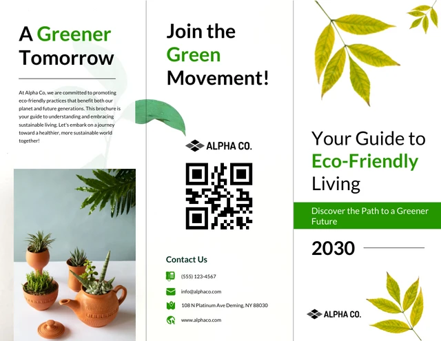
- If you are in the line of eco-friendly businesses or anything that is related to nature, sustainable living, etc, the idea would be to use calming greens, earthy browns, or soft neutral colors that suggest nature, and sustainability to your customer’s mind. Here is an example:
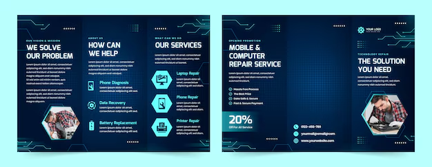
- For a tech startup or anything that resonates with infrastructure or appliances, clean whites, blues, and greys can be the right colors to show innovation and trust. Here is an example:
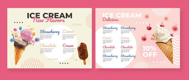
- A bakery or an ice cream brand might use warm tones like cream, pastel yellows, or soft pinks to create a welcoming, comforting feel. Here is an example:
A study from Marketing Journals has also proved which color evokes which emotions inside the mind of a reader with real-life surveys and tests.
The color palette you choose will solely depend on the type of business you have or the emotions that you want to evoke inside the reader.
Just make sure whichever colors you choose, harmonize with your logo and don’t distract from the content. Keep it consistent with your brand’s overall look. Don’t suddenly use neon pink if your website, logo, and/or store theme relies on subtle shades or pastels.
How do you decide this? Go to Pinterest and type in whatever your product is followed by the words “brochure”. For example, in our case, we will type “Organic juice brochure”. Here’s what I immediately get:
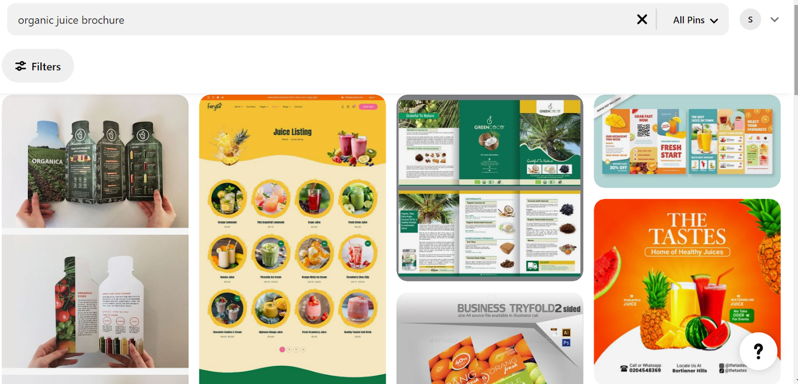
As you can see, I am getting calmer themes that match my product.
- Images
Once you have decided on a theme, you need to decide which images you want to use along with the text. It gives your brochure more depth and personality.
Try keeping the images in a way that builds trust and authenticity, and at the same time also evokes interest in the mind of the reader to try you out.
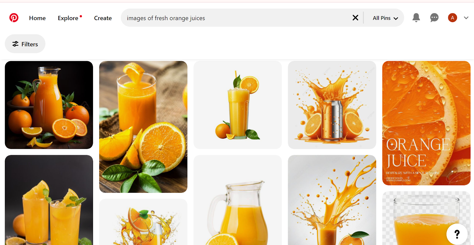
How to do it? You can either hire a cameraman and get some photos clicked or you can also search for them on Pinterest and attach them. Make sure they are not copyrighted material and are free to use.
Here is what I got when I searched for “images of fresh orange juices” to use for our orange business:
- Visual cues
If you have multiple sections or points, consider adding simple icons or small graphics to represent each. A leaf icon for eco-friendly points, a basket icon for bakery menus, or a gear icon for technical services work great.
I’m sure you’ve seen these icons in a lot of brochures, digital and print.
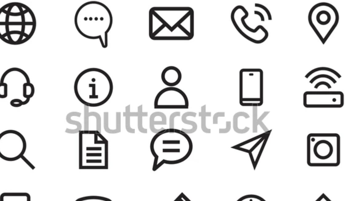
These visual cues help readers quickly understand what they’re looking at, making the brochure more accessible and fun to read. You can use Canva.ai etc to create stunning brochures or use their pre-uploaded templates if you don’t want to invest in a designer.
- Typography
Choosing a good typography is essential to enhance readability, improve engagement, and create memorability for your brochure. Just like colors, fonts also evoke an emotion inside the reader and reflect your brand identity.
Different fonts suit different kinds of businesses well, like for an eco-friendly business, soft and rounded fonts like ‘Poppins’ work best.
For a tech startup, clean and modern fonts like ‘Roboto’ are a decent choice, while for a bakery or cafe business, ‘Pacifico’ works the best.
How to decide it for your business? Go to Pinterest and search for “Brochure Typography for [your niche]” and open any image that you find attractive then go to the “MyFonts” website, upload that image and you will be able to see which font has been used.
Here’s what I got when I searched “Brochure typography for hotel business” on Pinterest:
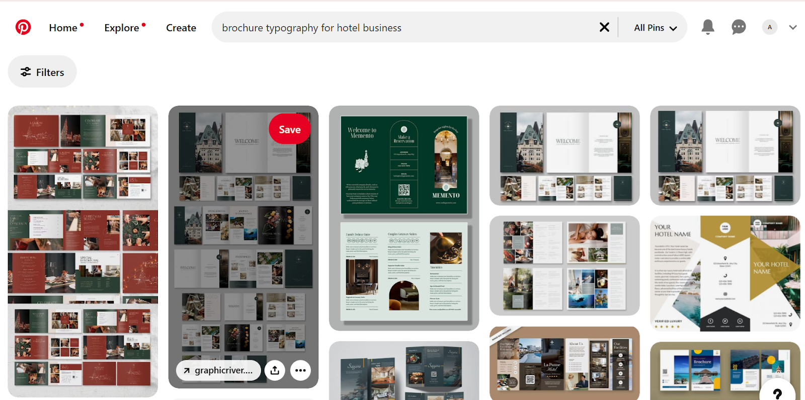
Here’s the font that MyFonts.com showed me once I uploaded one of the images on their website:
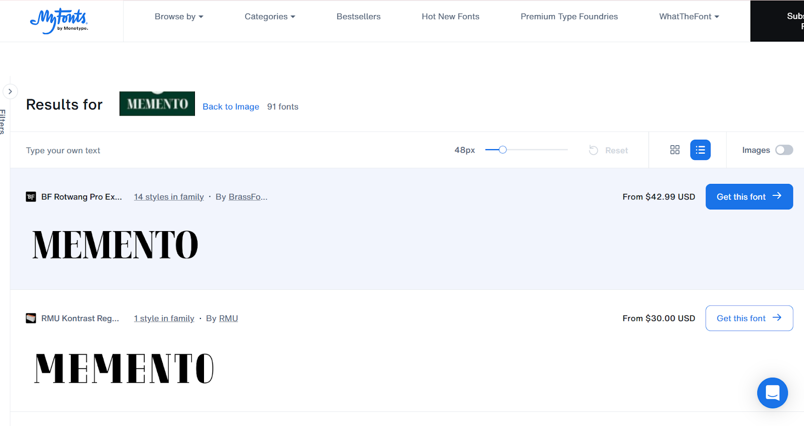
This signifies that for a hotel business, we can use the font ‘Memento’. You can do the same for your business niche to find out which font will suit you best.
Step 4: Printing a brochure
Once you have completed designing your brochure, the final step will always be printing it or going digital.
In physical printing, you need to make sure the paper thickness and finish match your business persona as you don’t want to convey something that you do not stand for.
An eco-friendly business can get away with a cheap quality of paper as they represent sustainability but a luxury real estate developer will need to have a glossy or matte finish.
However, in the modern age, everybody wants to go digital as it represents innovation. You can reach the masses through a digital brochure without spending a ton of money on physical printing.
The file format, resolution, and interactive elements will play an important role in making sure your brochure is engaging and accessible.
A PDF will be ideal as almost all devices support it while an interactive format with clickable links or animations can add a modern touch. Keep the resolution crisp (300 dpi minimum) and optimize file size for quick downloads.
Conclusion
Finally, this was everything I learned about brochures after spending 6 months and hours on them. You learned it in just a few minutes of reading and that’s great.
Now go on and create a brochure using my steps then let me know how it worked out for you because we already have predicted what you are going to message us, and that is “Thank you! It worked awesome”.
Common mistakes to avoid while designing your brochure
- Don’t include too much text as it could bore the reader. Use minimal text and bullet points wherever necessary.
- Avoid low-quality images as they reduce professionalism.
- Don’t miss out on having a clear call-to-action (CTA) since readers need direction to go. Add a bold and direct CTA to guide them on the next steps.
- Don’t ignore your target audience and make sure the design and writing style is to their liking.
- Avoid having inconsistent style or branding. Use the same fonts, colors, and styles as your brand identity, and don’t change it too often.
- Never leave out contact information.
- Don’t overlook grammatical errors as they could hurt your credibility and reflect negatively on the brand.
Frequently asked questions (FAQs)
1. How do I choose the right images for my brochure?
You must use high-quality images, which are directly related to your product or service. Don’t rely on stock images. If you’re showing products, use professional quality photos clicked in proper lighting.
2. How do I know if my brochure design is effective?
Ask for feedback from a small group of people from your target audience who you can share a draft with. Look if they get the message and if it’s visually appealing. Do an A/B testing of different designs (if possible) with customers and see which works better.
3. What if I don’t have a designer for my brochure?
You can use online tools such as Canva or Adobe Express that have pre-designed brochure templates. They are user-friendly and don’t require graphic design skills. If your budget allows, hire a freelance designer or make use of a professional printing service that may offer design help.
4. What if my brochure looks too cluttered?
Keep plenty of white space around your text and images. Use bullet points instead of long paragraphs and stick to a clean, simple layout. Avoid using too many fonts or colors.
5. How do I create a balance between text and images?
Make sure that the text-to-image ratio is 60:40 at maximum, more text than that will decrease readability. Each block of text must include a supporting image. For instance, if you’re talking about a product, write the description and add the picture of that product next to the description.
6. What if I have too much information to fit into the brochure?
Focus on the most important points and remove anything that doesn’t directly add value to the customer. Use QR codes or links to direct readers to more detailed content online if needed for print brochures and links to detailed landing pages/blogs for web brochures.
7. What if my brochure looks good on-screen but prints poorly?
Check the resolution of your images (300 DPI is ideal for printing) and ensure the colors are in CMYK mode, not RGB. Always request a proof copy from your printer to verify the quality before printing in bulk.
8. What is the ideal length for a brochure?
A brochure should typically be bi-fold (4 pages) or tri-fold (6 pages) to keep information concise and quick to read.
9. How much does it cost to create a professional brochure?
The cost depends on design, printing quality, and quantity. Simple designs cost less. Premium finishes and printing more copies will cost more.
10. Can I create a high-quality brochure without design experience?
Yes, by using templates from tools like Canva or Adobe Express. These platforms offer easy drag-and-drop features, allowing you to create professional designs without prior experience.
11. What is the best format for a digital brochure?
A PDF format is ideal for digital brochures because it preserves design quality, is easy to share, and works across all devices. Ensure it’s optimized for both web and print use.
12. How can I ensure my brochure stands out from competitors?
Focus on a unique design, clear messaging, and a strong call-to-action (CTA). Use high-quality images, highlight your unique value, and include interactive elements like QR codes or exclusive offers.


Leave a Reply